Moar art updates


Another week with art updates as the programmers have laid a foundation for the artists to fill in. Last week's version missed some items because of a missing plugin. So this week we made sure to fill those in again.
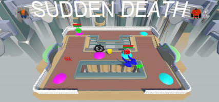
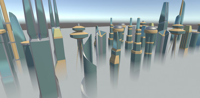
The background has a range of high rise buildings to show how high our arena really is flying! The arena itself has gotten some colour and some trims so that the characters have something better to fight on, The shape of the arena can still be subject to change after we have fought some battles on it and tested it. The colours currently used are just placeholders for the correct materials and textures later.
The blocky walls have been replaced with something with more shape and style.
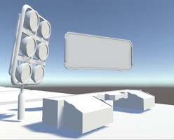
Currently a new scoreboard and more arena decorations are being made.
We plan to have some cool materials and visual effects next week so the game will be sweet to look at.
The programmers were still busy until now, but will continue with refining the movement and fighting after this.
Files
Get [Group 17] Dropkick
[Group 17] Dropkick
Score the enemy!
| Status | Released |
| Authors | ChrisMoerland, RubenVE, quintenhenry, KoenGoossens, lukasdewulf |
| Genre | Fighting, Action, Sports |
| Tags | Beat 'em up, Controller, Local multiplayer, party-game, Unity, Versus |
| Languages | English |
| Accessibility | Textless |
More posts
- The last Jedi... I mean UpdateMay 22, 2018
- Tidying up and controlled enviromentMay 16, 2018
- Finish line is just a step away!May 09, 2018
- RE::Coding_Action && NewColors + UI == ArtApr 25, 2018
- An art update, don't see those oftenApr 09, 2018
- Oh god! We messed up with multiple skins!Mar 28, 2018
- Selectionscreen in unity... such a pain!Mar 21, 2018
- Week 5 - Into productionMar 14, 2018
- Sometimes you just got to code hardMar 10, 2018
![[Group 17] Dropkick](https://img.itch.zone/aW1nLzEyOTg5MDEucG5n/original/CLiBsT.png)
Leave a comment
Log in with itch.io to leave a comment.